

What Makes an Announcement Slide Design Bad?
When designing Announcement Slides for your Pre and Post Service Loop, even if you are not a Designer, there are some things that are standard in the industry.
“I’m not a designer” is not an excuse for poorly designed slides.
I’m going to walk you through a few industry standards to make you look like a pro!
This post will focus on the Programs to use to build your slides and some tips on what NOT to do.
We will release another post on “What Makes an Announcement Slide Design Good?” soon.
Programs to Design Slides In:
I would suggest you create your Announcement Slides in one of 3 programs:
– Adobe Photoshop
– Adobe Illustrator
– Your Presentation Software (I recommend ProPresenter, MediaShout, or EasyWorship)
How much is Photoshop and Illustrator? Where do I get it?
You can purchase Photoshop for as little as $21/mo or the Entire Adobe Suite for $79/mo
Adobe Plans & Pricing
Are you new at Photoshop or Illustrator?
Lynda.com is a great site to find Tutorials and Courses for beginners. Here are two specific classes I like Become a Graphic Designer & A Quick Start with Adobe Illustrator
So, what makes a Slide Design Bad?
1. Poor Font Choice
Your font choice is very important.
Here are some fonts to NEVER use:
1. Papyrus
2. Comic Sans & its look alike (put a VBS ban on Comic Sans)
3. Bradley Hand
4. Brushscript
5. Curlz MT
6. Times New Roman
7. Vivaldi
8. Mistral
9. Impact
10. Stencil
2. Poor Choice of Photos
– Do not download photos from a Google search to use on your Announcement Slide – it’s illegal
– Do not choose photos that are outdated
– Do not use Poor quality or Low Resolution photos. Do not choose photos that are below a 1280×720 dimension size
– Do not don’t stretch logos or images past their original dimension size – it causes nasty pixelation and looks really bad on screen
Notice the example below of a bad Announcement Slide
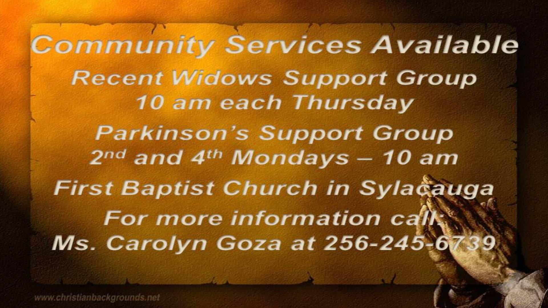
3. Poor Layout / Too Much Text
– Do not try to pour everything into your slide – do not try to fill all spaces with content
– Do not fill your slides with a mountain of text content

4. Poor Color Choices
– Bright colors like yellows, pinks, neon greens rarely look good on screen

I hope these few tips will give you some things to stay away from when creating your Announcement Slides for your Worship Experience.
If you need help producing slides for your church, feel free to call us at 910-849-1230 or Submit your Project here, we would love to help you.